
Apple iOS 5 Review
Most of the applications near the heart of iOS core competency have also gotten a refresh here. We’re talking stuff like Safari, Mail, Messaging, Photos, Music, Calendar, heck, even the Camera application gets a redesign here.
Music
I’d like to start by lighting a candle for the iPod application on the iPhone and iPad. It has joined the ranks of the dearly departed, having now been split into “Music” and “Video”, as on the iPod touch. Other than the branding, the major overall changes are being able to play music while syncing your device and a couple of interaction changes. You can swipe sideways on a song to bring up the option to delete it from the device, and a long press on a song title will bring up the extended song information. But for the most part, on the iPhone/iPod touch side of things, the Music app stays basically untouched. It’s on the iPad side where things have really changed.

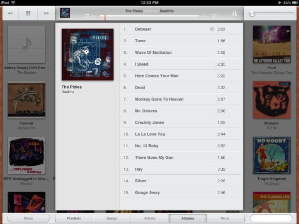
For starters, the iPad 2 now gets the ability to play 1080p video, but the real differences are in Music. The iPad gets a completely redesigned music player. While the previous iPod app looked like a lite-version of the desktop iTunes client, the new one looks nothing like it. You get a very low profile control/information bar at the top with playback controls and details on the song playing, plus a bottom bar to chose between playlist, song, artist, album, etc, along with a search field. The entire rest of the screen is dedicated to listing as many songs as possible. A few pixels on the right and left side have been devoted to thin, wood coloured borders. I legitimately have no idea why, since the colour they picked has nothing to do with the rest of the accent colours used in the OS (or any other version of iOS). It’s not a bad look, and it’s actually nice to have such a minimal interface for music.
Originally published at https://www.anandtech.com/show/4956/apple-ios-5-review (Wayback Machine).