
From Mango to Apollo: The HTC Windows Phone 8X on the Daily
The Windows Phone Interface
When Microsoft came up with the Metro Modern UI design language, their goal was essentially to streamline and simplify the interface as much as humanly possible. For me at least, this was a huge draw towards the platform (though I benefitted from arriving to the smartphone race late.) The Modern UI was designed to run in portrait mode, and it takes tremendous advantage of the increased vertical space.
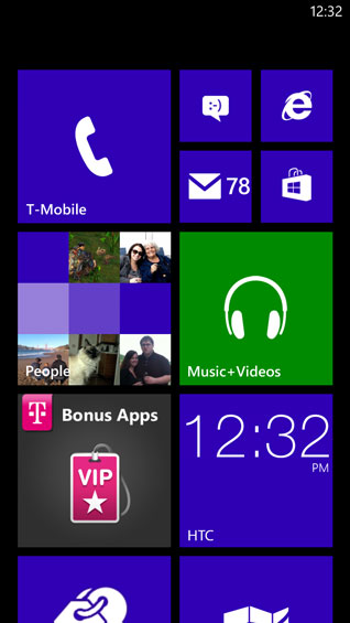
If you're unfamiliar with it, Windows Phone 8's interface involves two basic screens: the start page which features live tiles, and an application list. For WP8, Microsoft has gone from having two live tile sizes to three, and while I feel like it clutters the interface, it's ultimately much more productive. The tiles both launch applications and, depending on which applications they link to, can also provide useful information, essentially combining desktop widgets with shortcuts into a single useful "button." The tiles also tend to blend together in a much neater and more orderly fashion than widgets and icons do in iOS or Android, and they're very easy to rearrange and resize. Microsoft won't let you personalize your background (only your lock screen), but you can get a lot of mileage out of customizing the start page exactly.
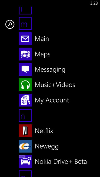
Meanwhile, the application list has amusingly been the standout feature of Windows Phone every time I've shown it to anyone: it's just that sensible. If you swipe left from the start menu, the application list is exactly what it sounds like: a vertical list of the apps installed on the phone, alphabetized. Icon on the left, name on the right. Once you reach a critical mass of apps, the letters of the alphabet pop up above each set of apps that start with that letter; you can tap the letter to bring up the alphabet, then tap the first letter of the app you want to find. Or, you can scroll up or down to it. Either way, to me at least, this is a very intuitive way of keeping the phone organized.
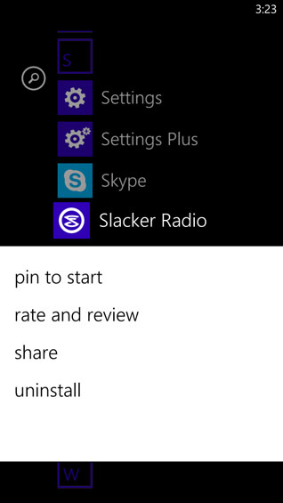
Finally, holding your finger on anything you're interested in brings up a menu that allows you to modify it. Uninstalling apps is as easy as choosing "uninstall app." "Pin to Start Menu" does exactly what it says. On the start menu itself, all of the tiles start floating, allowing you to rearrange them. You can resize them by tapping the arrow on the bottom right corner of the tile.
When you do use applications that employ the Modern UI design language, screens remain exceptionally clean. Since you're restricted to customization between having white text on a black background or black text on a white background and can only choose which accent color you want the tiles and highlights to use, the interface remains crisp and easy to understand.
Ultimately, between Windows Phone 7.5 and Windows Phone 8, the only immediately visible major interface change is the addition of the quarter-sized live tile on the start menu. You can add additional notifications to the lock screen and choose a single application to get a full text readout, but I felt like the one notification type seriously missing from the WP7.5 lock screen was a toast notification for whatever games I was playing with friends (i.e. WordFeud). Despite being able to assign a "games" icon to the lock screen, there's still no toast notification for any of the games I play. On the flipside, pinning the games I play regularly to the start menu allows the live tiles to indicate to me whenever it's my turn, so at least there's some way to know.
Originally published at https://www.anandtech.com/show/6692/from-mango-to-apollo-the-htc-windows-phone-8x-on-the-daily (Wayback Machine).