
CyberpowerPC's Compal PBL21: The Shark's New Teeth
Compal's Shark Evolves
While the internals have gotten their usual refresh, I'm pleased to report that the PBL21 has given the chassis a real update this time, too. In some cases it's two steps forward, one step back, but progress is always appreciated.
The lid and screen bezel have unfortunately gone almost completely unchanged, though. Glossy black plastic abounds, playing hell with photography and with the general appearance of the notebook. We've already been over my feelings regarding glossy plastic on the screen bezel so it doesn't bear repeating, but the takeaway here is that the top half of the PBL21 has the same issues with gloss that its predecessor did.
When you get to the main shell, though, you'll see Compal has divorced itself from the glossy gray of old and recognized what many of us already knew: black goes with everything. The frame of the keyboard is a glossy black accent, but the palmrest and touchpad are a textured black matte plastic that's a major improvement. Shortcut buttons and touch controls above and around the keyboard have been replaced by two physical buttons above it: power, and a toggle for USB charging.
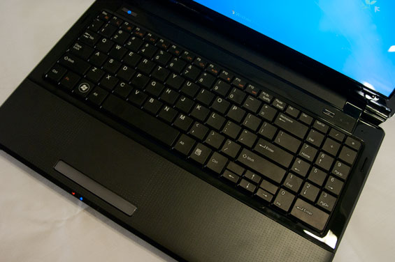
Unfortunately, the PBL21's keyboard is more of a lateral move than anything and I'm beginning to think that despite the ability to cram a 10-key into a 15.6" chassis, manufacturers should probably just avoid it. If the NBLB2's keyboard was mushy and flexy, the PBL21's has some of the same issues with flex along with being incredibly noisy and clicky. The layout itself isn't terrible, but the 10-key is borderline worthless. The whole point of a 10-key (a point Clevo doesn't understand either) is that it's standardized to allow you to use it by touch. But moving keys around the way Clevo and Compal do makes the keypad pointless. I'm also not at all a fan of using the keypad as shortcuts for document navigation, much preferring the column of document navigation keys on the right side of the keyboard (assuming a lack of 10-key) or a row above the number pad. Thankfully the keys are still the same classic matte style keys and not an island-style keyboard, so users who hate the chiclet keys that have become so common with modern keyboards will be happy with the PBL21.


The touchpad is once again part of the shell, only this time even less well demarcated from the rest of the palm rest. I still hate how this looks on modern notebooks; it takes away some of the magic and just feels chintzy. The flipside is that because Compal switched to a matte plastic for the palm rest, the touchpad is now vastly improved and much, much easier to use. Tracking and texture are solid, and though I still hate the rocker-style mouse button, it gets the job done.
All in all the Compal PBL21's build still feels a bit generic and spare as is customary with whitebooks, but it's much improved from its predecessor, seeming less bulbous and more streamlined.
Originally published at https://www.anandtech.com/show/4462/cyberpowerpcs-compal-pbl21-the-sharks-new-teeth (Wayback Machine).