
Battle of the Budget Tablets - Nook Color vs. Galaxy Tab
Meet the Contenders - Nook Color
The Nook Color is an interesting case. It’s technically an e-reader, and the included Android ROM never lets you forget that. But the spec-sheet says differently. A 7” 1024x600 IPS display, an OMAP3 SoC, and Android 2.2 for $249? Sounds like a budget tablet to me.
Gallery: Barnes & Noble Nook Color


On a hardware level, that’s basically what it is. As with most tablets, the front face is screen dominated, with a slightly larger-than-normal raised bezel and a stylised N beneath the display acting as the home button. The design of the Nook Color was handled by Yves Béhar and his team at fuseproject, one of the leading industrial design firms in the country.
You’d expect a device coming out of an elite design studio to have a very polished design, and the Nook Color definitely does. The design elements are very cohesive, with a final product that is at once attractive and very functional. The bezel is rendered in a metallic-look matte dark gray plastic, with a near-black rubberized back cover. Connecting the front and back faces is a matte silver rim around the four sides of the device, acting as a plastic band holding the device together. It’s a nice look, with slightly cooler shades of gray (probably 3-5% saturation of blue), and more importantly, the rounded edges make it very comfortable to hold, almost like a thin hardcover book. Almost makes you wonder if they meant for you to read books on it...
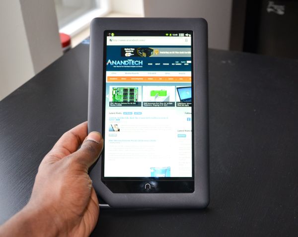
But the most notable industrial design feature of the Nook Color has to be the nook (for lack of better word) in the bottom left corner. It’s like a larger version of the through-holes you can find on some MP3 players and cell phones, but with basically no function beyond housing the microSD card slot (unless you really are planning on attaching a 7” tablet to a lanyard.) It’s more of a design quirk, one that adds a bit of character to the device, but an aesthetic element through and through. I’m a fan; it does a lot to break up the monotony that most tablets, especially ones with large bezels, suffer from while also making an amusing play on the Nook’s name.
The buttons and ports are built into the silver colored band, with the power button on the left side near the top, and the volume buttons near the top on the right side. The headphone jack is on the top and the microUSB on the bottom, as God intended them. The microSD card slot is built into the edge of the “nook” on the backside, under a flap bearing the Nook logo.

Overall, the Nook Color is bigger and heavier than the Galaxy, but that gives it a more significant feel in hand, and it definitely feels more durable and rugged than most of the other tablets out there. This is a combination of the larger bezel, the rubberized back, and the high quality matte plastic, and a welcome one. It’s a $250 device that really doesn’t look or feel like it.
Unfortunately, the spec sheet sheds some light on why it’s so much cheaper than the Galaxy. Let’s start with the CPU - it’s an OMAP3 processor, which means Cortex A8 and PowerVR SGX 530. So far so good. Specifically, it’s the OMAP 3621, an 800MHz part that is the basis of TI’s eReader platform. Okay, so an 800MHz A8 isn’t going to set the world ablaze, but it’s definitely livable, especially if we’re planning on tossing a bare-bones ROM onto this thing. Here’s the weird part. Like the Droid 2, the 3621 uses an IVA 2 DSP decode chip, and it can only do SD resolution video decode. So no 720p video.
Which is kind of a pity, because the display is gorgeous. It’s a 7” IPS WSVGA panel with a great contrast ratio, but we’ll get to that in a bit. Rounding out the rest of the specs, we see 512MB RAM, 8GB of onboard flash storage plus the microSD expansion slot, 802.11g wireless, an 8 hour battery, and a distinct lack of any cameras.
Originally published at https://www.anandtech.com/show/4302/battle-of-the-budget-tablets-nook-color-vs-galaxy-tab (Wayback Machine).