
Apple's iPad - The AnandTech Review
- Posted in
- Smartphones
- Mac
- Apple
- iPad
- Mobile
A Testament to UI Efficiency, Distinctively Apple
I've always called the iPhone OS a very efficient UI. The ease at which you can perform primary tasks on the iPhone is what I mean by that. By comparison, many earlier tablet and handheld computer concepts used full blown desktop OSes scaled down so much that you could hardly get anything done. UI elements were far too small to be navigated with portable screens. On the flip side, if you scaled the iPhone UI to a 22" desktop PC you'd also lose efficiency, the UI simply wasn't designed for that purpose. You use the right tool for the job and that's exactly what the iPhone OS, webOS and Android try to do. They are great smartphone interfaces.
The success of the iPad's UI is really determined by how well it scales up to the larger screen size and resolution of the display. Simply running iPhone apps on the iPad doesn't cut it, something that is made obvious by how little I wanted to use them on my iPad.
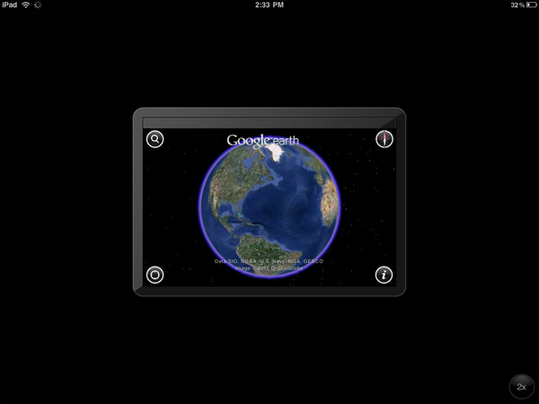
An iPhone app running on the iPad
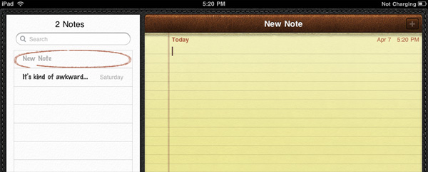
Thankfully, with the exception of running iPhone apps, Apple has ensured at that all elements of the iPad UI are enhanced specifically for the larger screen. The most obvious is the larger keyboard but there's also liberal use of columns in apps. You'll also note that there's very little forced consistency between the look and feel of iPad applications. Their UI is determined entirely by their function.
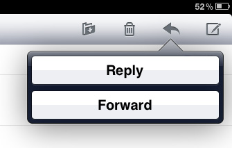
The popup dialog is also widely used throughout the iPad OS:
Thanks to the A4 SoC inside, multitouch gestures react even faster and smoother than they do on the iPhone. Particularly the pinch and stretch gestures for zooming in and out. Apple also introduced a new pinch/stretch to zoom feature in its Photos app. To expand or collapse any album or event simply take two fingers and stretch them apart or pinch them together. It seemed gimmicky when I first heard about it but in practice it works really well and I'd like to see it used in more places.
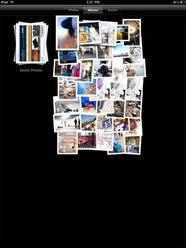
While not really significant to the plot, there are some nice touches that Apple has included with the iPad that are worth mentioning. The home screen is, er, home to a lot of the more prevalent examples of Apple flair. All the icons have a nice drop shadow behind them.
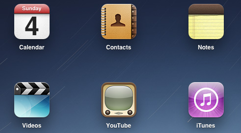
Bringing up the home screen from another app causes all the icons to fly in from the outside as if they're all scurrying home before you get there. Rotating the home screen also results in a sweet zoom out then in effect.
Despite having the screen real estate Apple doesn't get wasteful with UI elements. They are all fairly tiny and not intrusive.

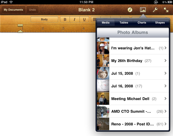
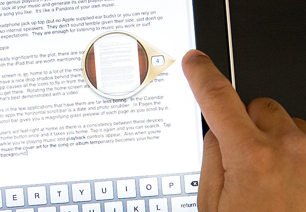
Scroll bars in the few applications that have them are far less boring. In the Calendar and Photo apps the horizontal scroll bar is a date and photo scrubber. In Pages the vertical scroll bar gives you a magnifying glass preview of each page as you scroll by it.
iPhone users will feel right at home as there is a consistency between these devices. Tap the home button once and it takes you home. Tap it again and you can search. Tap it twice while you're playing music and playback controls appear. Also, when you're playing music the cover art for the song or album temporarily becomes your home screen background.
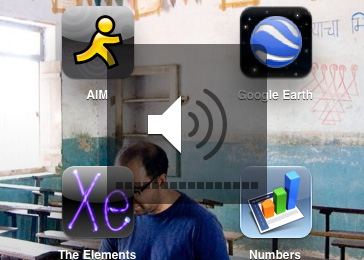
Although there's no mute button, holding the volume down rocker for 2 seconds mutes the device instantly.
There are dozens of little features like these that show an attention to detail that is missing from most products. Rushed or not, the iPad still has the little things that do make it an Apple product.
Originally published at https://www.anandtech.com/show/3640/apples-ipad-the-anandtech-review (Wayback Machine).