
iPod vs. Zune: January 2008 High End MP3 Player Roundup
- Posted in
- Smartphones
- Mobile
iPod Touch
Earlier we called the iPod Classic the old guard, and for good reason. The iPod line started as just an audio player and that's what the Classic does best. However it's also at an evolutionary dead end, it isn't practical to expand it to both be a more functional device and also the iPod Classic at the same time. The next step requires a clean break from the old guard and so we have the new guard, the iPod Touch.
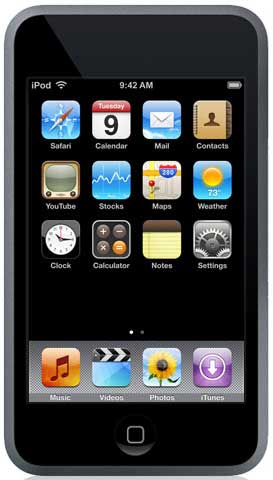
Fundamentally the iPod Touch is a stripped down iPhone. It has the same ARM processor, the same 512MB of RAM, the same version of OS X, the same 3.5" touch screen and many of the same applications. The Touch is for all practical purposes a very small PDA/computer optimized for media use. If you've read our iPhone review then you already know what to expect, otherwise keep reading.
Whereas the iPod Classic was the natural evolution of the iPod line, the Touch is practically unrecognizable as an iPod. The large touch screen eliminates the need for all buttons except a single home button, marking the end of the iconic iPod scroll wheel. You almost can't compare the two, they're simply such different devices that it's an iPod in name only.
Besides the large touch screen, as the new guard the Touch hardware also has a few other key differences compared to the old guard. In spite of being a high-end player in the price range of hard drive based players, it's flash memory based Coming in at $299 for 8GB and $399 for 16GB, it's $50 more expensive for 1/10th the capacity of the two respective iPod Classic models. This makes the Touch a gamble for Apple, compared to other players it's ridiculously expensive for the capacity it has.
Given the space needed to support the large screen, the more powerful electronics, and a larger battery to drive all of this we can see why Apple went with a flash based player, but there will be a lot of customers who will not want the Touch due to this issue. We're left curious just how big an Touch with a hard drive would be; based on how the iPhone has been received, we could see something up to the size of the iPhone still being practical, especially since the Touch is starting out at only .31" thick.
With that said since it's an iPod and supposed to be primarily a media player, we'll jump to the more pressing question of its media player abilities, before getting in to the utilities and the subtleties of the hardware design. For playing audio, the classic iPod hierarchical navigation system is still in use, but with modifications for the touch screen. It's good to see that Apple decided to not rock the boat too much here, as the hierarchical navigation system is still every bit as good on a touch screen as it is the scroll wheel.
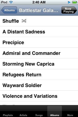
Unfortunately we can't say much else that's nice about the music UI, and it's not for a lack of trying on Apple's part. The touch screen just isn't a great replacement for the scroll wheel; Apple was tasked with replacing the perfect media player control and couldn't do it. A touch screen means we no longer have blind navigation and the touch screen can't offer the kind of precise controls the scroll wheel can, meanwhile the bigger screen isn't doing anything more for us.
Volume and song position are particularly bothersome, as the screen is only a good three-thumbs wide, making it easy to adjust something incorrectly or requiring more time and concentration to adjust something to precisely where you want it. It works, probably as well as Apple can ever hope to achieve, but it's definitely not as good as the scroll wheel.
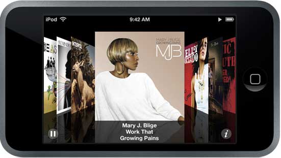
We also are not very impressed with cover flow, the alternative UI that allows browsing songs by cover when the music application is open and the Touch turned on its side. It looks pretty and it's easy to use, but we're not sold on it actually being useful. On the one hand it's extremely reliant on having cover art for all of your songs, and on the other hand it's extremely reliant on you knowing the cover art for every album is to make efficient use of it. Text may not be as fancy as artwork, but in the digital age cover art just isn't as meaningful when we don't have a real copy of the art anyhow. We'd really like to have an option for a widescreen UI when the Touch is turned on its side, it would help us deal with the volume and song position issues we mentioned previously, due to the fact that we could have longer volume/position bars.
Other than these issues, the Touch is a competent audio player. The format support is the same as the Classic and the audio quality is the same (we'll have more on that later in our benchmarking section) so on a technical level it's just as good of an audio player as the Classic is. If it wasn't for the fact that the Touch used a touch screen and had to forgo the scroll wheel, it would be just as good as the Classic. The touch screen is the Achilles Heal of the device that drags it down as an audio player.
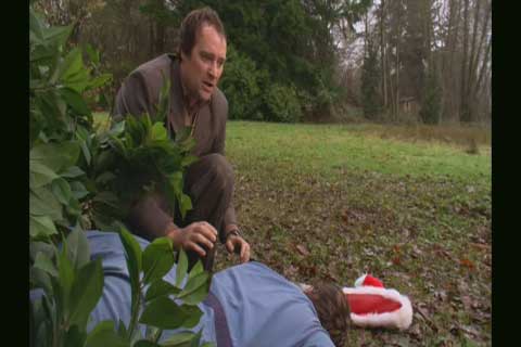
Yet on the other hand the Touch's video abilities put the Classic to shame; unlike the Classic it's clearly designed for video use. It still suffers from the general control issues brought about by the touch screen, but unlike the Classic the nearly device-sized screen makes watching videos practical and something that you'll actually want to do with the device. With a resolution of 480x320 (twice that of the Classic) and a 3.5" screen, the Touch is extremely comfortable to watch videos on. It's not quite perfect because of the control issues, but it's very close.
Incorrect formatting
Correct formatting
We did find an issue with letterboxed videos however; with one of our test videos encoded at 640x480 the touch proceeded to completely cut off the letterboxing, distorting the image. We don't have any other videos that this occurs on so we can't gauge how prevalent the issue is, but never the less it's there and bears mentioning.
Originally published at https://www.anandtech.com/show/2423 (Wayback Machine).