
Revisiting The Google Pixel C - Better, But Not There Yet
Display Comparison
Due to the nature of smartphone and tablet sampling, it's not often that we get two units of a device sent to the same reviewer. Since I already had to set this Pixel C to 200 nits for battery life testing, I figured that it would be interesting to see how the accuracy compares to the original review unit that we received. While a sample size of two is still hardly enough to make any definitive conclusions on the variance from unit to unit, it is an interesting exercise in seeing how far or how little two completely different units differ from one another. If you're looking for more commentary on the Pixel C's display I encourage you to check out the display analysis page in original review.
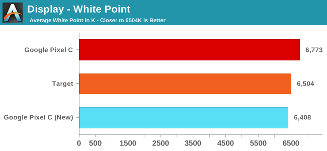
Something that I quickly noticed about this new Pixel C unit is that the display is warmer than the original one. This is hardly a surprise, with all mobile devices having fairly high variability with the white point. While the last one was above the standard illuminant D65, this one is a bit below. What this does imply is that Google is probably hovering around D65 with their white point target, so there doesn't appear to be a heavy shift toward the blue to improve battery life, which is something you do see on many other smartphones and tablets. The low power LTPS panel is seemingly able to keep power low enough that shifting toward blue to improve backlight efficiency isn't required to achieve good battery life.
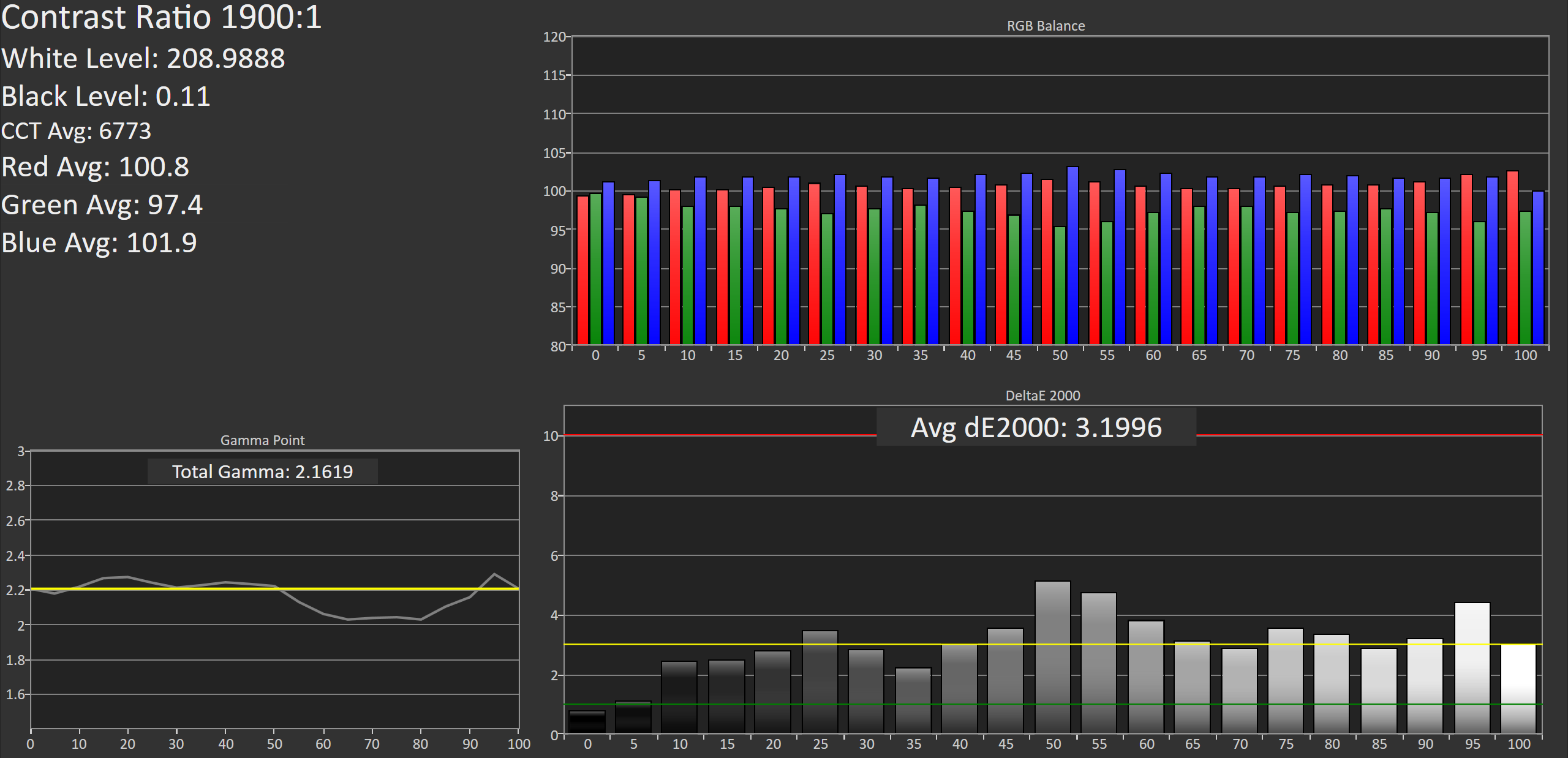
Original Pixel C
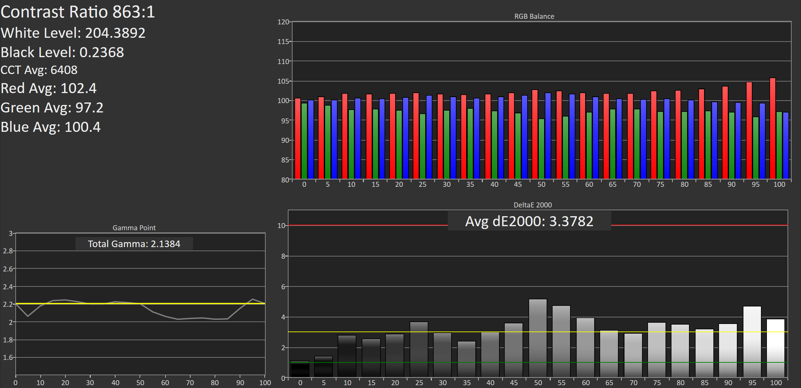
New Pixel C
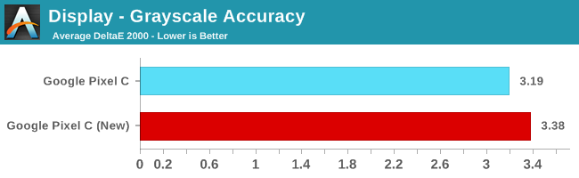
This new Pixel C performs a bit worse in our greyscale accuracy test, but the difference really isn't noticeable. In fact, the similarity between the results on both devices is almost spooky, although it really just speaks to the level of consistency Google is enforcing. Due to the green component of luminance dropping off as you move toward 100% white you see similar errors for each shade of grey. I actually tested again to make sure I hadn't accidentally tested the same unit twice, even though the differing white points made me fairly sure of that. While Google isn't giving you ridiculous levels of calibration with DeltaE values below 1, it is clear that they're fairly consistent with targeting a DeltaE of around 3 for greyscale.
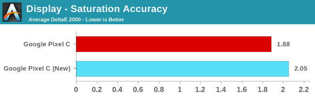
Saturation accuracy drops a bit on the new Pixel C, but it's really not a big enough difference to make an impact on even highly color sensitive workflows.
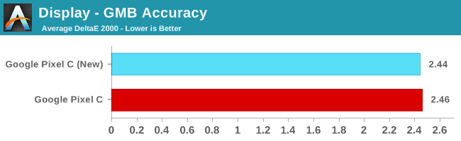
In the color checker test we see that both Pixel C units have equivalent average error values. There's not much else to be said here, as both panels are at a point where further improvements to color mixture accuracy won't really bring any tangible benefit.
As I said before, two units is hardly enough to make a conclusion about Google's calibration standards. That being said, you can definitely use the data to get an idea of how tight their tolerances are. I think in this case it's clear that you'll be getting a pretty accurate display with the Pixel C, and the biggest difference will be whether your white point leans more toward red or blue.
Originally published at https://www.anandtech.com/show/9996/revisiting-the-google-pixel-c (Wayback Machine).