
HTC One mini 2 Review
- Posted in
- Smartphones
- HTC
- Mobile
- One mini 2
Display
As always, a crucial part of the smartphone experience is the display. While it’s easy to make subjective judgments on the quality of a display, such judgments directly led to the rise of deliberately oversaturated displays and generally worse calibration quality, as while a calibrated display is good for the sake of reproducing an image as the author intended, it may not be as appealing as a deliberately oversaturated display. Therefore, for these tests, we turn to Spectracal’s CalMAN 5 to test the quality of smartphone displays. As always, we target sRGB colorspace for these tests as sRGB is the de facto standard for web content. Adobe RGB can be tested, but only for profiles that are explicitly targeting such a color space. At any rate, alternative color spaces are extremely rare and difficult to use when Android still lacks color management systems.
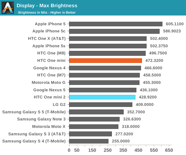
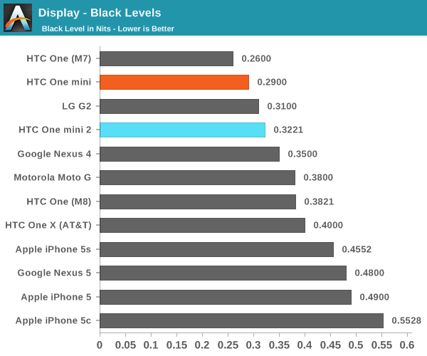
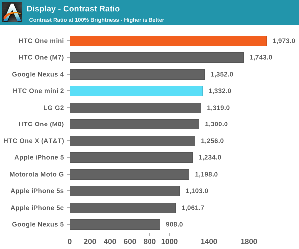
In the case of the One mini 2, it’s best to start with the basics. In maximum brightness and contrast, the One mini 2 does respectably. The panel appears to be of high quality, which very little color shifting with change in viewing angles, and is only noticeable when at specific angles. The 720p resolution is also a good fit for a display of this size. Although it’s noticeably not as sharp as the 1080p displays found in high end phones, it’s not a significant problem at all. The one potential issue is minimum white brightness, which is 14 nits. This is a bit uncomfortable for reading at night, and HTC should try to target 7 nits or lower for the next generation.

Quick note: This is from the second review unit, and the contrast number is from the i1 Pro, the true contrast ratio is 1332:1.
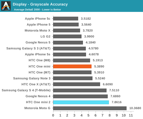

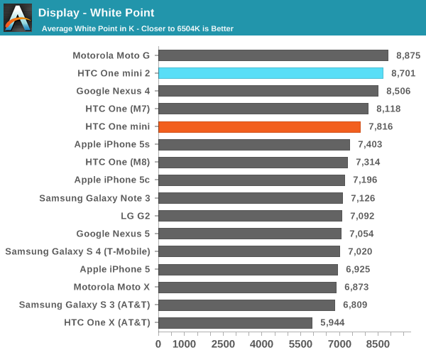
Unfortunately, this is where we run out of good things to say regarding the display. Grayscale is poor, to say the least. The white point is significantly too blue, at 8701k and 8387k between the two review units that we received. It’s clear to me that HTC has made a strategic decision to go for higher peak luminance and “whiter” whites rather than solid calibration in this department.
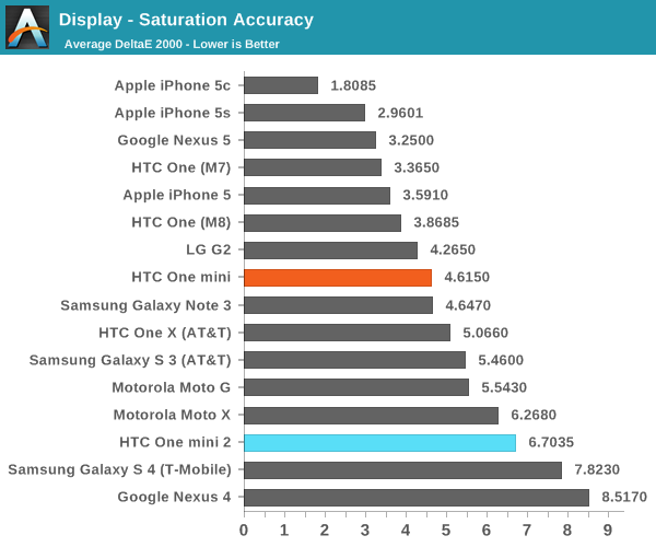

The same story can be seen in the saturation sweep test. While the display is strangely slightly undersaturated in the reds, every other color tested effectively made 80% saturation equal to 100% saturation, presumably in an attempt to wow the average consumer trying out a demo unit. There are also some significant issues with cyan and magenta saturations, which are strongly skewed towards blue. Possibly the most telling problem with this calibration is that 20% yellow is the closest to proper white on this phone.
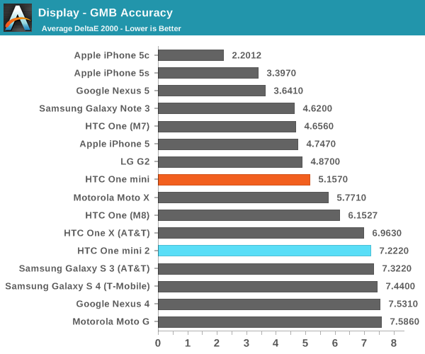


The poor performance in the saturation test translated to the Gretag Macbeth colorchecker, which the One mini 2 also does poorly in. It’s hard to explain just how poor this phone does, but the simplest way to explain it is to say that the performance is on par with the Moto G, and worse than the LG Lucid 3. While some issues are a function of lack of calibration, the saturation compression is most certainly a calculated decision. I understand the motivation behind this decision, but HTC needs to include a toggle to turn off “color enhancement”, and for the price that HTC is asking for this phone, the overall calibration must improve. The One mini 2 is regressed from the One mini in display accuracy, and this is simply a trend that has to stop now.
Originally published at https://www.anandtech.com/show/8004/htc-one-mini-2-review (Wayback Machine).