
Understanding Camera Optics & Smartphone Camera Trends, A Presentation by Brian Klug
- Posted in
- Smartphones
- camera
- Android
- Mobile
Evaluating Image Quality
How do we evaluate quality from an image? Tomes have been written about this, and really there are many things to look for in a good image. Chief among those is really sharpness, or MTF, the modulation transfer function. That’s a discussion in and of itself, but basically MTF plots show us how much contrast we will see in a square wave at a particular spatial frequency. MTF also tells us about what the highest frequency (spatial resolution) will make it through a system, this is the cutoff frequency. There are other things to look for too, like third order aberrations.
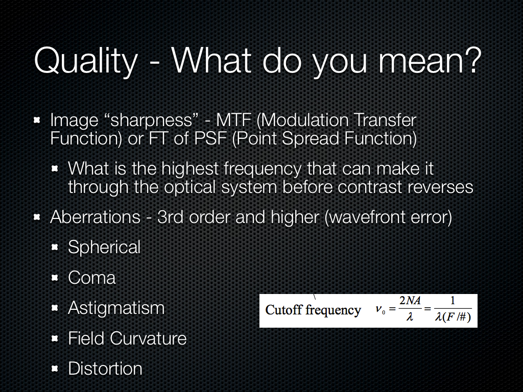
No camera system is perfect, and good design balances one aberration against the other. If we look at field dependency the most difficult part of an image for a designer is the edges, where aberrations increase quickly.

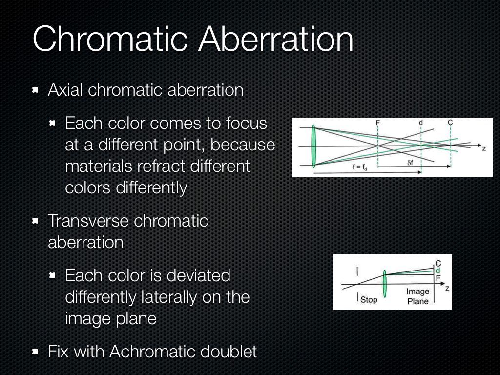
These previous aberrations have been monochromatic, there are also aberrations which exist as a function of wavelength or color. Axial chromatic we can fix with a doublet to some extent or try to minimize. Transverse is what we sometimes see with color fringing, although in most commercial systems purple fringing is often an artifact of ISP.
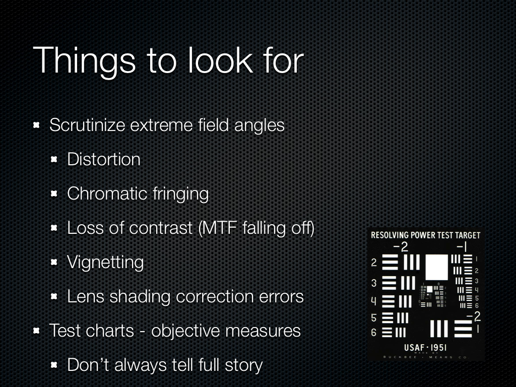
So what can we look for? Again, distortion is visible quickly since these systems in a smartphone are so wide angle. Chromatic fringing since this is annoying and something easy to notice on silhouetted subjects. Obviously sharpness is a big deal, does the image look blurry. Finally the presence of any residual vignetting and lens color shading, despite lots of gnashing of teeth from the optical designers and lots of ISP tweaking — which if you’re like my ex girlfriend you’re going to add back in with Instagram or Twitter filters to look “vintage,” you hipster. Test charts will tell us a lot, and there are many good choices, but good test scenes sometimes tell a lot more.
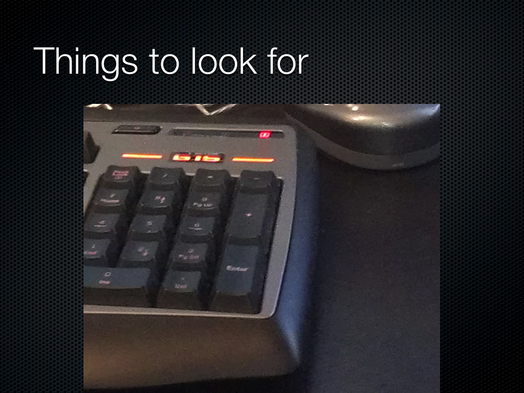
I hate pictures of keyboards in reviews since they’re the laziest subject of all to photograph when doing a review of a smartphone, but here’s one I couldn’t resist. The image is so noisy I can’t read the keys, and the totally homogenous desk looks awash with luminance noise. There isn’t much chroma (color) noise.
Here’s one I complain about a lot, huge halos around contrasty regions thanks to the sharpening kernel or unsharp mask applied to the image. This is an attempt by the OEM to add back in spatial resolution or contrast after killing it all with noise reduction, and after you see halos you won’t un-see them. We can also see some serious moire in the bottom left, partly why I love that scene.
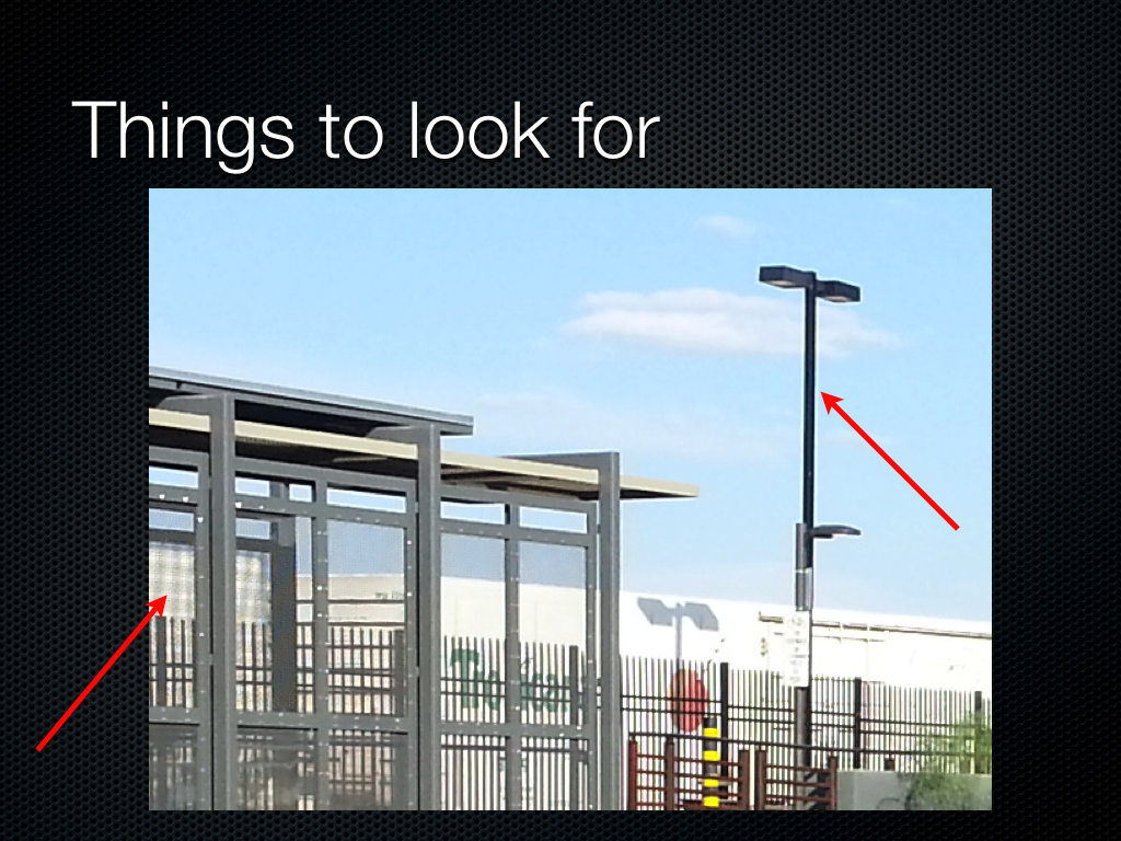
This is a photo from a recently released device which clearly has some strong field curvature. Again the center of the image is easy to get nice and sharp, but if you look at the edges, it gets dramatically blurry. The center is easy, the edge of the field is hard.
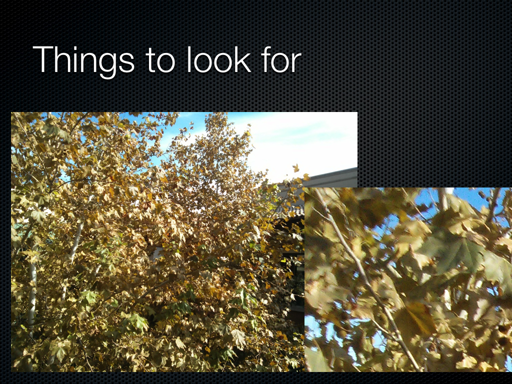
There was a very popular phone which was criticized for having some purple color stray light visible in the image when a light source was just out of the field of view. It turns out stray light is a big issue for everyone, since obviously nobody wants a huge lens hood sticking out of their phone, or at least industrial designers don’t. Well, again, this isn’t an isolated problem for just one vendor, it’s something everyone has. I believe the purple color gets picked up from a magnesium fluoride antireflection coating or some other AR coating.

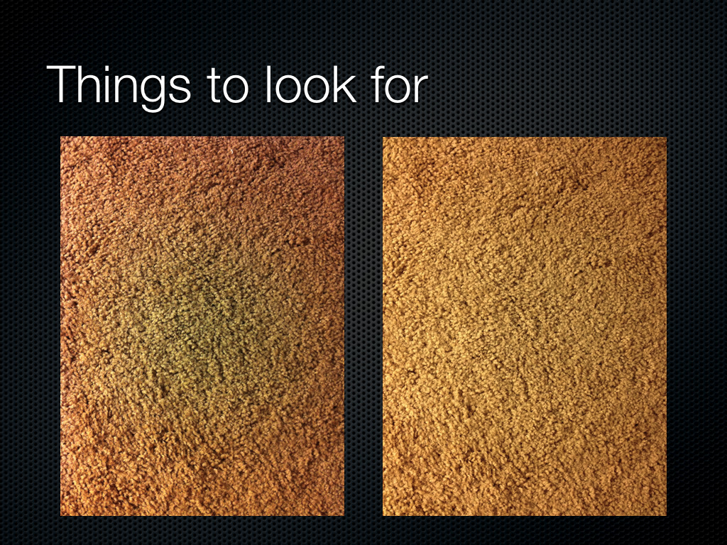
The image on the left is from a very popular device, and the image on the right is of the next generation of this popular device. The left image has a very pronounced green spot in the center, and then a definite red ring around the outside. After you see this pattern, it’s unlikely you’ll be able to un-see it. I used to play a game on Reddit looking for the green circle in people’s images, then going and checking EXIF, and about 90 percent of the time I could nail what smartphone this was coming from, just from the green spot. This is classic failure to correct for lens color shading, either their ISP couldn’t do it or they didn’t characterize it well enough, but it was fixed in the next generation. These lens shading errors are incredibly annoying when taking a photo of a subject with a flat monochromatic field, like a book, whiteboard, or so forth.
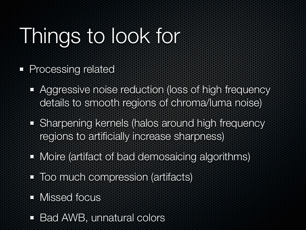
There are other things that I look for as well, aggressive noise reduction, again moire, bad auto white balance are pretty easy to spot. Another annoyance are cameras which completely miss focus, even on very contrasty scenes which should be easy to focus on with contrast based auto focus.
Originally published at https://www.anandtech.com/show/6777/understanding-camera-optics-smartphone-camera-trends (Wayback Machine).