
Motorola Atrix HD Review: Fast, Sharp, Bargain
- Posted in
- Smartphones
- Motorola
- Mobile
- Atrix HD
A good smartphone these days needs a great screen. To that end, marketing lingo offers nothing. Motorola has dubbed this 4.5” TFT-LCD display, its ColorBoost display. I’m not sure what that means, but I do know that the 1280x720 panel has a lot of potential. We take displays seriously, and so, like every other aspect of our reviews, we try to gather as much objective data as we can. There’s something to be said for subjective analysis though, and so we’ll start with that. I want to like this display, but something bugged me from the moment I lit it up. I think this is what people feel when they say they hate a PenTile AMOLED display's color balance. PenTile never bothered me much, but the Atrix HD display does. I couldn’t come close to seeing individual pixels from a normal viewing distance and there were excellent viewing angles, but that’s something we’ve come to expect from any tolerable handset. There was something else . . .
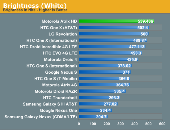
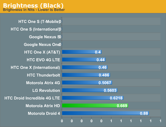
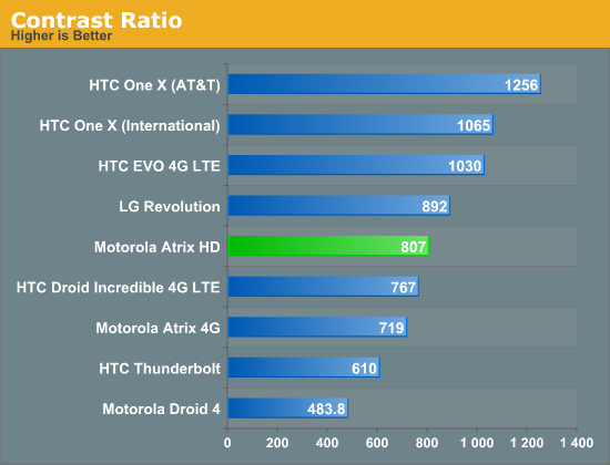
Chart topping brigthness makes me recall Motorola's use of PenTile RGBW in many of last years models to boost brightness. There’s no such trickery at work here, just a powerful backlight. Such a strong backlight has its deficits though, and in this case it’s the black level that falters a bit. We’ve seen worse, and the contrast remains respectable. So if all of this looks good, what is it that bugs me about this phone’s display?


We use ColorHCFR and Voodoo Screen Test Pattern to characterize our displays, and one of the most delightful features is that it builds these great charts. Two charts I’ll highlight here spell out my issues pretty clearly. The simplest is the color temperature chart (right, and a bit difficult to make out), which breaks down the color temperature at the various intensities. What we see is a distinct and drastic blue push, so much so it's off the charts at a few measurements. The CIE chart, gives us a clearer look at what’s happening. The plane is one defined color space, and the black triangle represents the sRGB color space, the standard for CE displays. The white triangle is the Atrix HD’s display’s color space, and you can see a distinct shift towards the blue in this triangle. That shift makes for vibrant blues, but it also makes other colors fall off their mark. I’ve always been a pixel density enthusiast (I’d never considered owning a TV larger than 27” until 1080i was in play), but as the mobile industry continues to scratch that itch, I find myself disgruntled with shifts in color accuracy. What does this mean for everyone else? Honestly, go play with it. I can tell you that it’s bright and dense with good contrast, but that I don’t like the colors. You might love them, and that’s fine. That’s the thing about subjective analysis, it depends on the subject.
Originally published at https://www.anandtech.com/show/6118/motorola-atrix-hd-review-fast-sharp-bargain (Wayback Machine).