
Apple iOS 5 Review
Notifications and the Notification Center
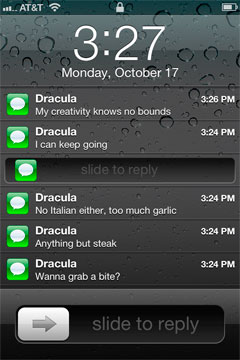
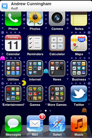
At first glance notifications on a locked iOS device appear to be simply restyled. Instead of a blue popup with white text you get a black popup with white text - and an app icon. Unlike previous versions of iOS however, multiple notifications now appear in a list on the lock screen rather than simply replacing the notification that was there previously.
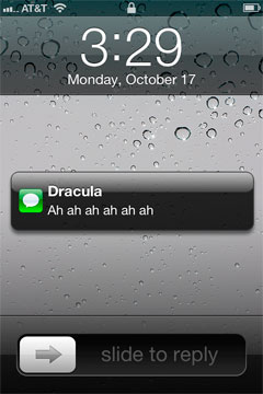
The list of notifications can get very long (we didn't test to see if it would ultimately stop, but you can now display at least 30 notifications on the lock screen) and iOS 5 allows you to scroll through them:
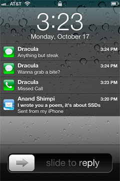
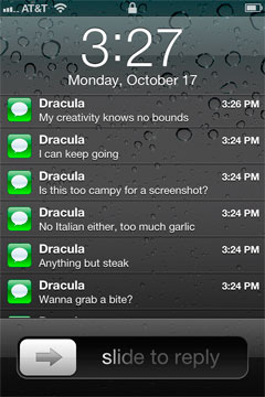
This feature alone is worth the upgrade to iOS 5 as it's a huge improvement in usability. You can now quickly get the gist of any SMS conversation and ensure there are no urgent emails that need tending to with a quick glance at your locked phone. Interacting with notifications from the lock screen is also improved, you can now slide over any notification to address it specifically:
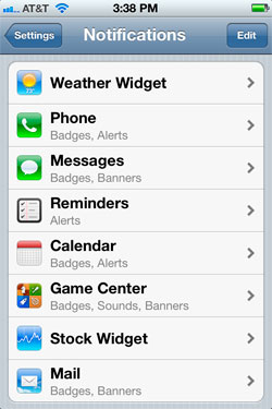
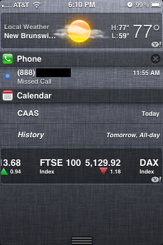
Swiping a finger down from the top of the screen reveals the new Notification Center, where your active notifications are all listed (some apps, like Weather and Stocks, can also display permanent widgets here if desired). Notifications are listed by app, and will disappear from the Notification Center once addressed or cleared manually by the user.
Pulling down the notification shade in a full screen app is a two-step process: pull once to reveal a tab and pull twice to reveal the shade. Apple does this to avoid any accidental shade activation.

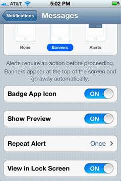
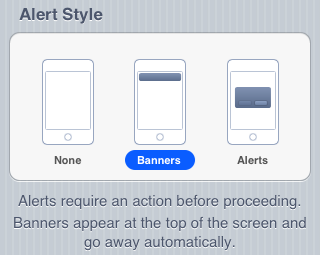
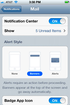
The number of notifications per app in the Notification Center is customizable:
On the iPad, Notification Center works mostly like it does on the iPhone - although obviously occupying less of the screen:
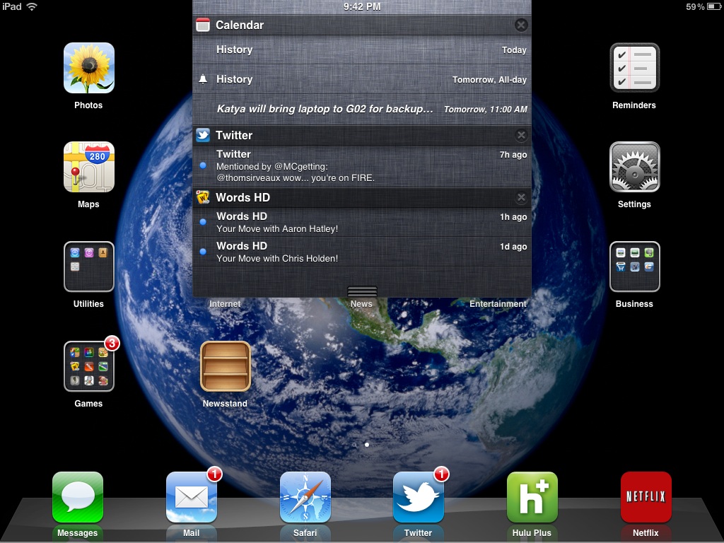
The impact of the revamped notification system is arguably even more pronounced on the iPad as the previous system was a significant burden to productive use of the tablet.
The verdict? None of these features are exactly new to smartphones (Android users, especially, will note many similarities to the notifications shade) but the implementation is smooth and it really goes a long way toward making iOS more pleasant to use - the best software upgrades make you wonder how you got by without the improvements they bring, and the notification improvements achieve that goal.
Originally published at https://www.anandtech.com/show/4956/apple-ios-5-review (Wayback Machine).