
HP EliteBook 8760w: Color, So Dreamy
If Only Your HP Pavilion Looked This Good
Honestly, the more I play with enterprise hardware the more I wonder why we have to keep putting up with unattractive, kitschy designs in the consumer field, and the HP EliteBook 8760w really hammers it home. The 8760w isn't just a massive improvement on its predecessor (whose three-tone design wound up being a mess of clashing styles), it's a massive improvement on notebooks in general. Understanding the materials used in the construction of something like the 8760w are much more costly than the cheap plastic used for bargain basement notebooks, it's still tough to argue that it doesn't look better than the lion's share of Windows-based notebooks available.


If you read our review of the HP EliteBook 8460p or any of our continuing coverage of the 2011 HP refresh, nothing in the design of the 8760w is going to seem new to you. As a 17" notebook, it's sizable without being needlessly bulky; many of the gaming notebooks we've tested are both heavier and broader.
The gunmetal gray finish with silver accents is a constant throughout the entire design except for the bottom, though the lid enjoys a spiral brushed aluminum pattern and an HP logo that glows when the system is on. When you open it, you'll find a matte screen (much more on this later) with a clean black matte trim and fairly minimal flex owing to the reinforced frame.
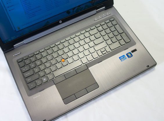
Inside surfaces are largely the same gunmetal gray, of slightly varying shades, with the touch-based shortcut bar on the 8740w completely removed in place of four physical silver buttons: a wireless toggle, a mute button, HP's QuickWeb shortcut, and a calculator shortcut. Each of the buttons are lit with white LEDs, and the keyboard itself is backlit white with white LED toggles on the Caps Lock and Num Lock keys. Flex on the keyboard is minimal, and the touchpad surface is a joy to use, but undoubtedly some users will be bothered by the switch to the chiclet keyboard that's become the de facto standard across all of HP's notebooks, consumer or business. Personally I'm fine with it, but the arrow keys remain a sore spot for me: while the double-sized left and right keys aesthetically fill out the design, from a practical sense they feel strange compared to a garden variety directional key set.
Everything else about the feel of the 8760w is absolutely stellar, though. The keyboard is easy and pleasant to use, the touchpad has exactly the right amount of traction, and the three mouse buttons (take that, Apple!) have just the right amount of travel and resistance while making virtually no noise.
When you flip the 8760w over, you find the same fantastic single service panel that HP has deployed across their entire business line, making the notebook incredibly easy to service or upgrade. Honestly this is a development I wouldn't mind seeing carried over to consumer notebooks, although the difference there is that while a business notebook is designed to be serviced by an IT department, I can just see some hapless end user mangling their shiny new $500 laptop by popping off the bottom and messing with the insides. Maybe it's for the best that this stays in the market it's in.
As a whole, the HP EliteBook 8760w's design is much more minimalist and functional than its predecessor, owing at least lip service to the Jonathan Ive school of form and function intertwined. HP's mentality with their 2011 business notebooks is that "business" doesn't have to mean "stodgy," and they've hit a near perfect compromise with their new EliteBooks.
Originally published at https://www.anandtech.com/show/4673/hp-elitebook-8760w-color-so-dreamy (Wayback Machine).