
Motorola Droid 3 Review - Third Time's a Charm
Display - qHD RGBW 4”
The original Droid and Droid 2 famously used high quality 3.7” IPS panels, and as a result had excellent contrast and brightness. What always struck me as being a little odd with the arrangement was that the devices used the 16:9 FWVGA (854 x 480) aspect ratio instead of WVGA’s 800x480. The difference was subtle, but as a result the Motorola Droids always did seem more rectangular than most of their other Android bretheren. Since then, qHD has become the hot new high-end Android resolution, which vindicates Motorola’s by likewise being 16:9.
Aspect ratios aside, it’s interesting to me how obvious it is that qHD is the answer to the iPhone 4’s retina display. I’ve been told that the development cycle for most of these handsets is anywhere from 12 to 18 months, and look no further than your calendar and when qHD devices have started shipping to see that in action. Whatever the reason for qHD’s emergence, it’s good to have some display innovation take place.
The Droid 3 ups the size of the primary display from the 3.7” which adorned the old Motorola Droids to 4.0”, and as already noted increases effective resolution from 854x480 to 960x540. Like the Droid X2 and other new qHD Motorola phones, the Droid 3 uses a PenTile L6W RGBW subpixel matrix to achieve effective qHD resolution. I talked about RGBW in the Droid X2 review, and what it boils down to is the inclusion of a fourth white subpixel which increases light transmittance (and thus reduces required backlight power) in a lot of use cases.


Left: Droid 3 with RGBW PenTile, Right: Droid 2 with RGB Stripe
Unlike the other RGBG PenTile which adorned AMOLED displays before Super AMOLED Plus swung around, I find RGBW much easier to stomach and completely readable when presented with black on white UIs. Colors still have visible grain, as do some UI elements, but the Droid 3’s 4” display makes this considerably less noticeable than the same resolution on the Droid X2. Only on bright colors is that extra space due to the fourth subpixel readily visible, and thanks to our color-specific visual acuity, greens are the most visible.
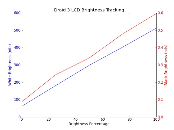
I immediately noticed out of the box with the Droid 3 that it wasn’t as super bright as the Droid X2, which was itself almost shockingly bright. That said, the Droid 3 is no slouch and is likewise nice and contrasty as well.
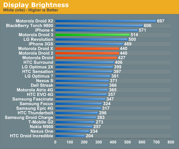
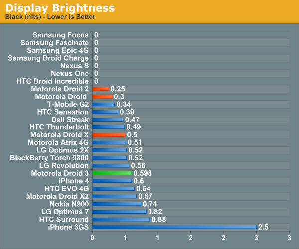
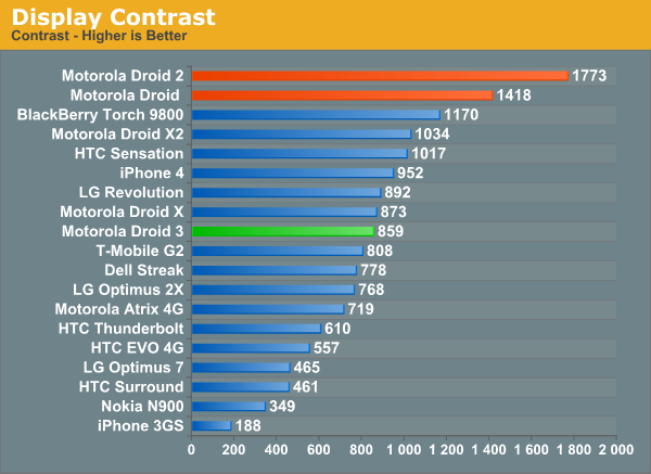
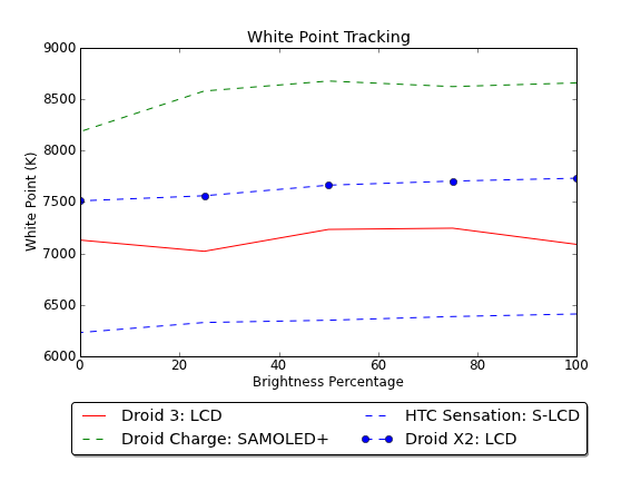
We’re still making plots of brightness (white and black), and white point at 25% brightness steps. The Droid 3’s white point tracking is slightly different from the X2’s despite also using RGBW. It ends up not being visibly blue like some of the AMOLED variants nor noticeably warm like some of the earlier Droid panels were in odd batches.
The next are of concern are viewing angles, which in my opinion the Droid 3 does very well at. I stuck the Droid 3 next to the Droid 2 and shot some pics of it at different angles. It’s surprising to me in retrospect how much color shift and contrast reduction there is in the old Droid 2 by comparison. In this regard, the Droid 3’s display is a clear step forwards.


 Left: Droid 2, Right: Droid 3
Outdoor viewing angles are decent on the Droid 3 are pretty good but not totally perfect. RGBW helps keep brightness punchy but in my mind outdoor viewing remains an unsolved problem for just about everyone.

Originally published at https://www.anandtech.com/show/4551/motorola-droid-3-review-third-times-a-charm (Wayback Machine).