
Apple's iPad - The AnandTech Review
- Posted in
- Smartphones
- Mac
- Apple
- iPad
- Mobile
Apple gives you most of the essentials with the iPad. You get Safari, which we just finished talking about and an iPad version of the Mail app.
This is another one of those situations where it’s just a pleasure to read email on the iPad. I actually found myself unlocking my iPad just to read email on it while I was sitting in front of my desktop.
I hate to sound like a broken record but the combination of the touchscreen and the awesome display really help make the Mail app great. Switching between accounts still requires far too many taps, and there’s no easy way to select and mark a bunch of messages as read.
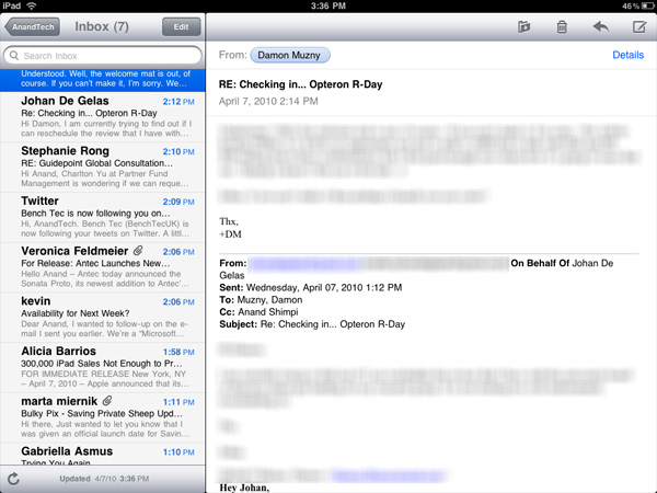
Mail, like many apps, is a bit more useful in landscape mode (you can view your inbox and selected message at the same time).
Being based on the same iPhone OS as the iPhone means that the iPad suffers from the same glitches. Sometimes when I get a new email it will appear then disappear. I have to wait for the app to check my email again or manually force it to see that message.
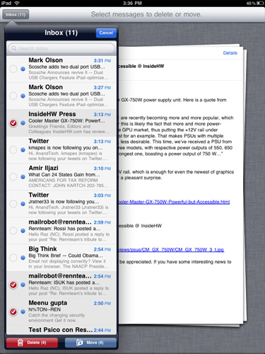
Another annoyance is the total lack of scroll bars on the iPad. While scrolling via touch works well in most cases, once you start displaying a lot of information (e.g. my entire inbox) you have to do a lot of touching to scroll from top to bottom. A simple grab and hold scroll widget would help a lot. It’s odd to me that there isn’t a single app that ships with the iPad that has this.
But if you’re away from your desk, the iPad can serve as an excellent stand in email client.
The Calendar and Contacts Apps
I've rarely used Digital planners, they never really felt right to me. The exceptions were my time with the Palm V, some years with Blackberries and more recently the iPhone. Something about the way their calendaring apps worked just seemed to fit well with my mental routine. Even then I didn't use them as much as I actually needed to, only critical events and reminders got entered in.
The iPad calendar is the closest thing I've seen to a daily planner in digital form. Apple just got the feel right with this one. Date selection is fast as is event input. I find that the UI of a good calendar app determines my likelihood of using it, and Apple got it right with the iPad. Ultimately it's just a scaled up version of the iphone app (like most apple iPad apps) but the visual flair it got in the transition from small to big is awesome.
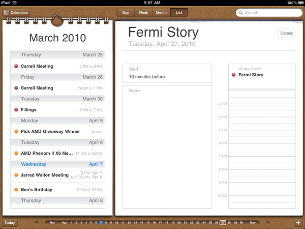
The calendar uses the scrubber UI element, but instead of flipping through photos you're scanning through dates. Flipping through pages also uses the popular page turning animation.
I'm sure heavy calendar users can easily find limitations with the app. But for regular users, it's very impressive.
The contacts app is straight forward port from the iPhone. It works and is one of the only apps to use the equivalent of a vertical scroll bar. Just run your finger over the alphabet on the left side and you can scroll through your virtual rolodex.
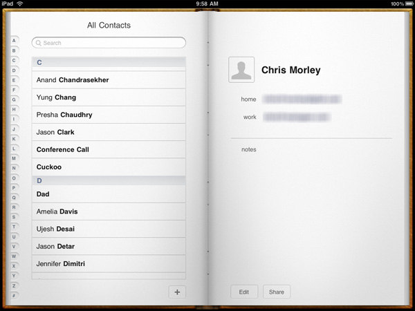
Apps like contacts are simply easier to use just because of the increase in screen size and resolution compared to the iPhone. Apple did an amazing job making the iphone UI very efficient and with some minor tweaks it scales very well to a nearly 10" screen.
Originally published at https://www.anandtech.com/show/3640/apples-ipad-the-anandtech-review (Wayback Machine).