
Anand Reviews the Apple iPhone 3G
- Posted in
- Smartphones
- Mobile
Clutter Awaits!
The iPhone doesn’t support third-party background tasks, and as I applauded in the original review, its whole goal is to kick applications and data out of memory as quickly as possible to maintain the fastest interface possible. This approach is partly necessary to ensure that the iPhone can appear to be faster than other smartphones built on similar hardware, but it also makes sure the phone can scale with the number of applications you have installed.
Theoretically, it shouldn’t matter if you have zero or forty applications installed, performance should remain identical since all they do is take up space on the iPhone’s writable flash yet don’t remain resident in memory. I didn’t notice any performance degradation as I kept adding applications to the iPhone 3G, but admittedly I could only find around 21 that I wanted to have installed.
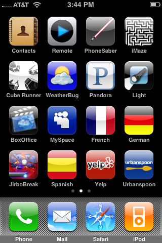
You can now have multiple home screen pages, you swipe to view additional pages. My second homepage is just App Store applications.
But even with only 21 applications installed, the iPhone’s home interface quickly becomes cluttered. You quickly have to reorganize the iPhone’s home screen to optimize for frequently used first and third party applications.
The original iPhone’s interface worked because it was so simple, something many considered a detriment given that the iPhone lacked basic smartphone or cellphone features. My thinking was that Apple honed in on the top 10 features that it wanted to get right and focused on perfecting those, which it absolutely did with the original iPhone. The problem is that with the 2.0 firmware and the app store, the iPhone takes a dangerous step towards becoming more like Windows Mobile. The balance between program functionality and UI was tilted far in favor of UI with the first iPhone, but with multiple screens of applications and very little connecting them together, the tides are beginning to turn.
By no means am I taking issue with the app store, it’s clearly an important part of Apple’s strategy and as you’ll soon see, there are a number of applications that will actually help make this phone even better. The problem becomes what happens when you’ve got so many applications that you use on a regular basis that navigating between them all becomes an issue?
Apple helped addressed this on the desktop through the use of the Dashboard in OS X 10.4. The Dashboard provided one simple interface for things like notes, weather, stocks, the calculator and more, unfortunately porting that to the iPhone wouldn’t really work given that you’re constrained by screen size. The concept however, I believe, is similar to what Apple may need to do going forward.
When all of the applications you needed to run fit on a single home screen, things were fine. Once that number grows significantly, we start to straddle the line between feature-packed and cumbersome. Apple’s iPhone interface is far from the mess that is Windows Mobile, but it’s headed in that direction. I do hope, for Apple’s sake, that the next iPhone update actually encompasses more than some minor hardware/physical changes.
Originally published at https://www.anandtech.com/show/2571 (Wayback Machine).